DEDICATED TO ME AND THE REST OF THE WORLD
|
 S WE KNOW THE FUTURE, WHICH IS MENTIONED IN WALT KUHN’S DEDICATION, IS HAPPENING RIGHT NOW. AND IF WE DON’T OVERWHELM OUR ENCHANTING WORLD WITH DINGHY GASES, ROBBER BARONS, ENTERTAINING FUNDAMENTALISTS, BORED BOURGEOISIE, BRITNEY GAGAS AND CHRISTINA GUGUS, THE FUTURE MIGHT LAST FOR A WHILE AND THE ach!so CONTEMPORARY ARTIST, TOO.
 IF YOU ASK ME …
What, in your opinion, makes a designer a good designer? What is of utmost importance in this profession?If you ask me, good graphic design can never follow down the path of least resistance. Always doubt your decisions. Force yourself to do things you wouldn’t normally dare to do. Don’t ever feel confortable about your work, even if it has reached a wider acceptance, keep questioning its relevance. Basically, don’t expect anything from your achievements. |
Don’t try too hard to be original, instead, try to be consequent, clear and honest to yourself. Don’t ever base your work solely on visuals and aesthetics. Don’t refer to or base your work on famous great artists or movements, create your own logic. Don’t aspire to be avant-garde. Don’t perceive graphic design only as a service to satisfy a client, and don’t ever work to only surprise your client, always try to surprise yourself. And most importantly: Don’t ever take things too seriously! |
Sounds like this approach can produce really unpredictable outcome — from brilliant solution to total failure. And the path to the final result is always unclear. But are there any general rules or formulae in your practice? If design is unpredictable, what is design theory and what should students be taught in design schools?In my opinion, theory is just a desperate effort to keep up with an artist’s indefinable and unseizable |
mind. The artist is the uncontrollable figure of action and the theorist is just trying to implement logic and explain the artist’s decisions to a wider audience. Nothing else. Theory shouldn’t be taken too seriously and it shouldn’t be decisive for an artist’s work. I’d like to see that students are taught to be aware of this fact. Of course, they should learn about past ideas and movements in art and design. But at a certain point, students should also develop their own way of thinking and proceeding, maybe in a way which |
doesn’t appear necessarily conclusive and is not based on past achievements. And no, I don’t have any general rules or formulae in my practice, expect that I try to contemplate every possible direction of a work.In your design practice you probably make some designs that you consider “bad” and some that you can call a success. Can you tell in general, why good design that you made turned out to be good and why your bad designs happened to be so? |
What reasons in the process, in your opinion, influenced the outcome?To be honest, I don’t ever know if a new work is going to be good or bad. I think an artist can’t ever be sure if something will succeed or fail (an artist’s dilemma.) Sometimes, I’m really convinced about a work and then nobody likes it. And sometimes I create the biggest bullshit and people think it’s great, and there’s no real explanation to this. Still, I think an artist should be brave and dare to |
break out of comfort zone; and instead of aiming at good or avoiding to create bad design, the work should rather bring up the question of what is actually good, and what could possibly be bad.If you’d be absolutely free to choose any commission you’d like, what would be your criteria for judgement? What a perfect assignment looks like in your opinion? What applies of graphic design do you consider good and which are dull? |
I’m fine with any kind of project. I just need the freedom to think in any possible direction, good and fruitful talks with the client or the collaborators, which in the best case lead to a genius idea. A perfect assignment depends more on the given conditions than on the given subject.Questions by Roman Gornistky, |
NO GLAMOUR!
While most graphic design seems to be obsessed with glamour, Aleksandar Todorović’s work is conceptual and political. He’s an artist, who observes the mass culture, creates work dealing with mainstream objects, criticizes mass consumption, likes to surprise himself, is more interested in the process than in |
the result, believes in the victory of contemporary art, thinks he’s avant-garde, doesn’t commit himself to a specific medium, hates the art market, gets drunk at art openings, likes to expose himself and adores success. In short: an ordinary artist of today. |
|
|
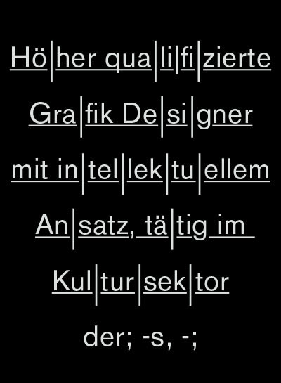
Der höher qualifzierte Grafik Designer mit intellektuellem Ansatz, tätig im Kultursektor, ist die Bezeichnung für einen zeitgenössischen Grafik Designer, dessen Visualisierungs-sprache sich hauptsächlich an vergangene Ideologien in der Kunst und dem Grafik Design [→Avantgarde, Moderne, Fluxus] anlehnt. Jedoch handelt es sich hierbei nicht um eine inhaltliche Weiterentwicklung bzw. Fortsetzung dieser Ideenwelten, sondern um eine rein visuelle (und somit oberflächliche) Bezugnahme. Auf den ersten Blick nicht erkennbar, täuscht der kulturell |
ausgerichtete Grafik Designer meist ein direktes oder ernsteres Interesse an einer inhaltlichen Auseinandersetzung nur vor [→Egomanie, Selbstdarstellung, Facebook].
|
Hierbei teilt sich der Berufsstand in zwei Gruppen auf: Gruppe Eins ist neben Arbeiten im kulturellen Sektor auch im niedriger qualifizierten Konsumsektor tätig, der aufgrund von Mangel an intellektuellem Ansatz oft kein hohes Ansehen genießt. Jedoch kann eine Tätigkeit im Konsumsektor meist nicht vermieden werden, da der Kultursektor praktisch als nicht rentabel bzw. selbstfinanzierbar gilt. Um einen unerwünschten Bezug zum Konsumsektor zu verhindern, verwenden solche höher qualifizierten Grafiker Pseudonyme und verzichten auf ihren Namen im Impressum. |
Gruppe Zwei lehnt den Konsumsektor offiziell ab, hat gleichzeitig aber auch keine höhere Anerkennung oder Einkommen im Kultursektor. Der daraus resultierende Misserfolg führt zu einer ausgeprägten Identifizierung mit den Vertretern der genannten Ideologien [→Bohème, Selbstreferentialität]. Meist erhielten Künstler dieser Epochen erst nach vielen Jahren eine Anerkennung für ihre Leistungen und wurden erst im Nachhinein als “avantgarde” bezeichnet, welches Gruppe Zwei dazu verleitet, sich in ihrem Misserfolg als neuzeitliche Avantgardisten bestätigt |
zu fühlen. Der wesentliche Unterschied liegt jedoch im Umgang mit Grafik Design. Gruppe Zwei fällt eher durch das Auftreten auf Freizeitveranstaltungen wie Partys, Ausstellungs- & Galerieeröffnungen [→Berlin-Techno, zeitgenössisches Museum, Free-Drink] auf als durch eine intensive Auseinandersetzung mit der Profession. |
FORM FOLLOWS FORMALITY
Nein! Hier geht es nicht um die Form! Sondern um den Verfall (zur Formalität)! Und übrigens, die DOKUMENTA, dieses seltsame freizeiparkende Etwas, das immer wieder in der Provinz stattfindet, weil es ja dort fernab vom Markt sei, und jämmerlich versucht avantgarde zu sein (Stand 1912), ist die Stiefmutter aller Formalitäten. |
|
|
|
|


ABSTRACT OR NOT ABSTRACT?!
|
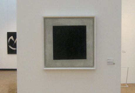 Standing in front of this famous painting in the Central House of Artists in Moscow, I felt a bit sorry for it. Somehow the abstraction in arts, which in the beginning was filled with conceptual meaning, intellectual ideas and revolting ideologies, became totally worn out like any other style in arts. Super-boring: the ‘I-make-something-which-you-don’t-understand-at-first-so-you-start-making-your-own-intepretations’ concept. Well, at least I don’t feel intrigued by it.
WHATEVE
Idea art, concept art, minimal art, classical art, applied art, meaning of art, changing of art, sense of art, consequence of art, freedom of art, state-of-the-art, Museum of Modern Art, art theory, art academy, art master, art gallery, art director, art book, artificial. |
So many art forms and none of them helped me to understand art. During my end exam period I tried to dig into the art theory and art history of the late 20th century, just to understand why we are where we are. Conclusion: Keep your hands off! There’s no absurd timewasting activity like this! |
JOYS/CHOICE OF LIVING
New York, Amsterdam, Paris, Moscow, Berlin – every city sports a specific appearance in order to attract a certain group of people. Some cities seem to be so cool that some people would drop everything and do everything to live or be part of that city. Walking through Belgrade, a rather unattractive example, I realized that dozens of empty mansions from the past centuries were left abandoned and rotting away. After the socialist regime and the country’s collapse in the 90s, the city has got |
a lot of unused spaces. Standing in front one of those beautiful mansions, I wondered why we are so drawn to the hipster spots and choose miserable life quality, just to be part of something which is actually quite abstract. I also wondered how many great and fantastic ideas, conclusions, enlightenments or even movements are actually hidden behind those walls and never will be discovered, just because no creative mind is ready to start a life in a hype-less spot. Well, maybe I’ll do it one day! |
MICKEY SUPPORTS CULTURE
To be honest, I don’t have such a strong opinion on the Berlin art scene. However, there’s one thing going on which might be the greatest happening in art ever: the reconstruction of the Prussian castle in the heart of East Berlin. I do think that’s a remarkable idea because it also punches the arrogant and crusted contemporary architecture scene right in the face, those people who are totally superficially obsessed by the “new”, considering this as the only possible solution. |
Unfortunately, the project is on hold due to skyrocketing costs. I suggest to contact Mickey and Minney alias Walt Disney Imagineering – they make hotels, theme parks and cruise ships – and co-finance the whole project. I mean, they have a lot of experience in building castles looking like this anyway. Maybe the facade will be rosé but hey, the only purpose will be the same anyway: to attract millions of tourists every year. |
|
|

RTS / PTC
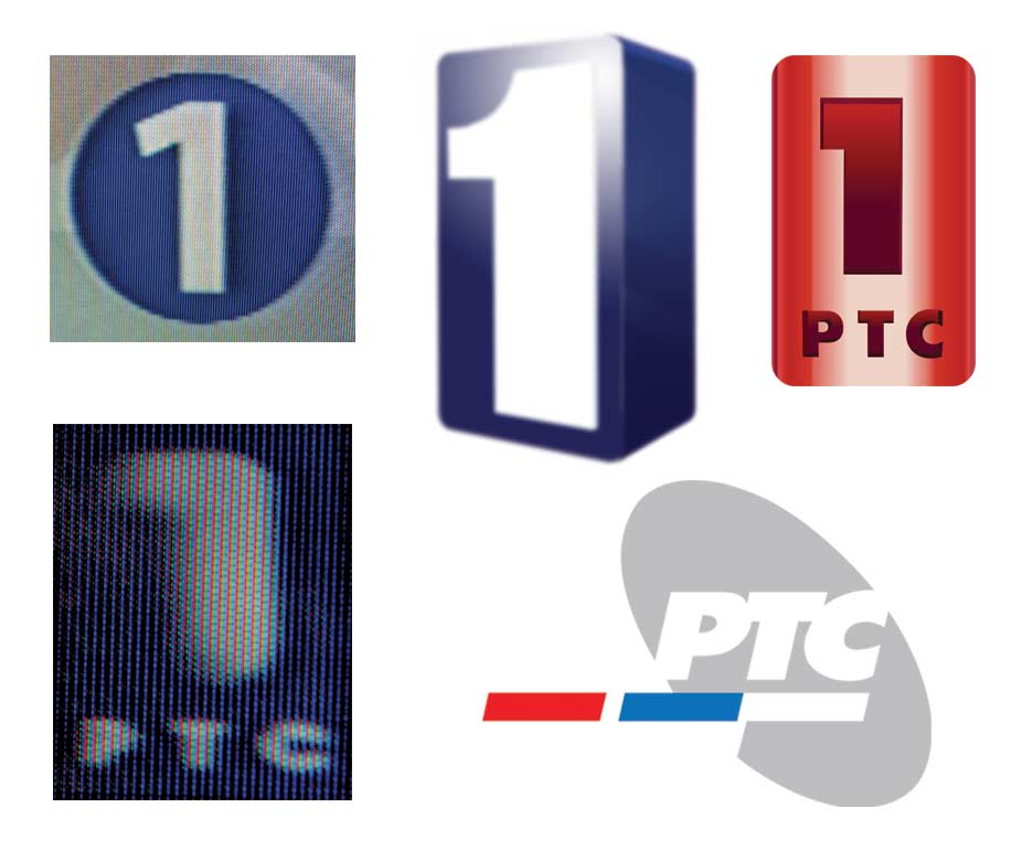
There’s no such thing as good taste in Serbian television’s decor. Extremely colorful interiors made out of cheap materials, mostly packed with sponsored logos, plastic flowers, a flat screen which is supposed to symbolize up-to-dateness and visible rough corners between the blue screen projection and the real world, are elements of an average Serbian studio. |
Compared to flashy graphics or elaborate corporate designs seen on CNN or any other Western TV station, Serbia’s TV appears very unprofessional, inexperienced or simply totally inadmissible. On the other hand, this unconscious unprofessionalism creates a certain charm. Observing the first national channel called RTS or in Cyrillic |
PTC (Radio Televizija Srbije), one absurd fact attracts attention: Five differently designed number ones represent the channel’s logo, which I collected here. There probably were several graphic designers assigned to design a logo, and in the end, they used every single draft. But Serbian viewers don’t seem to care or even notice the difference. |
|